There is a strange split running through the American economy right now. Look at a chart of the S&P 500 and you would think we were living through a boom. Look at the people actually living in the economy — their credit card statements, their gas bills, their answers to survey takers — and you would think we were in a recession. Both readings are real. They cannot both stay true forever.
For most of modern history, the stock market has been described as a leading indicator of the economy. When markets rise, the thinking goes, it is because investors collectively see better days ahead. When they fall, they are seeing trouble before the rest of us do. That framework still gets repeated on financial television almost daily. But it requires a connection between what markets price and what the underlying economy actually produces — profits, wages, sales, the financial health of the people doing the buying.
That connection has stretched thin. In some places, it has snapped.
The Two Charts That Don't Match
Two data points, both released in the past few weeks, tell the story by themselves.
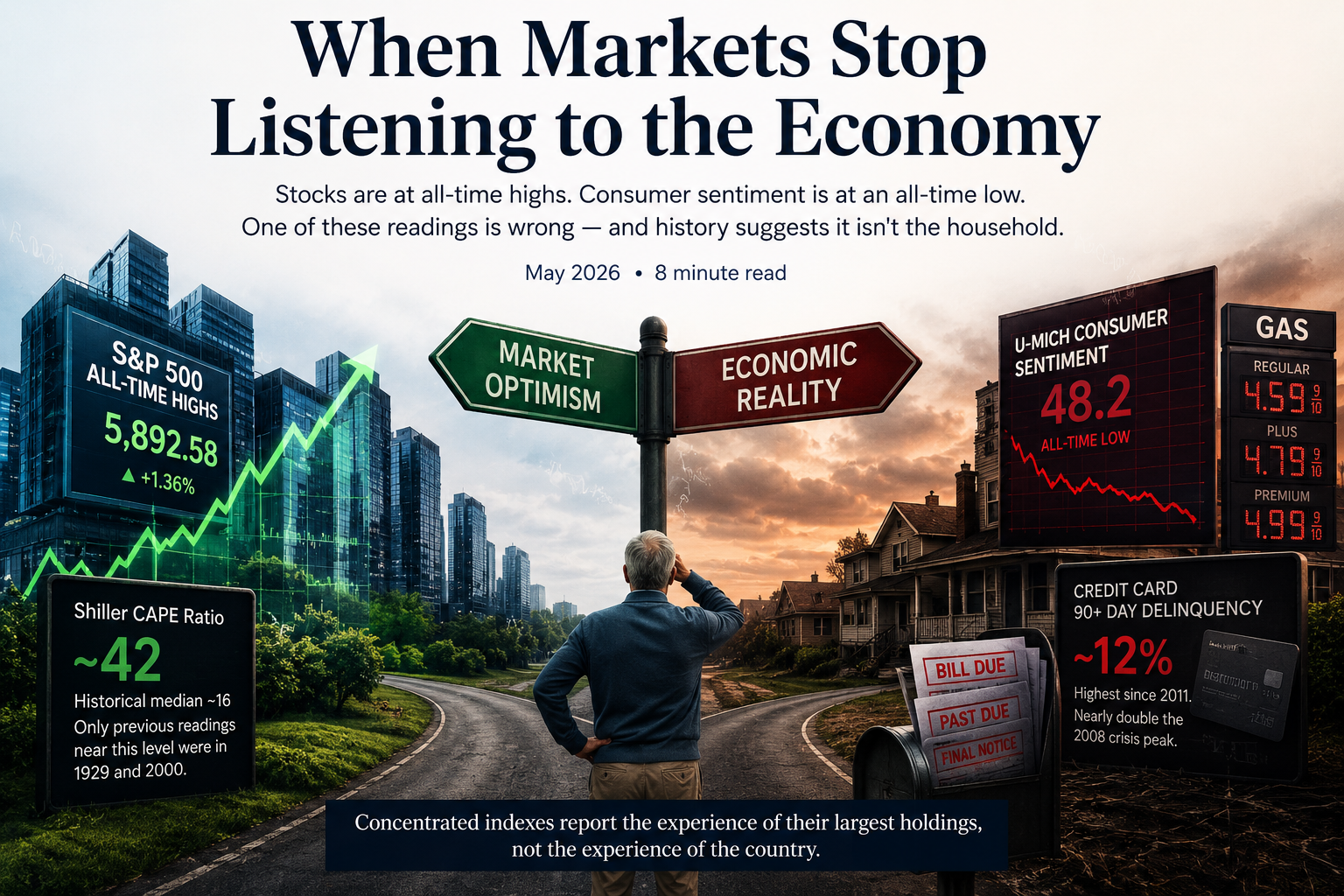
The S&P 500 just posted its sixth consecutive weekly gain, hitting new record highs. The Shiller cyclically-adjusted price-to-earnings ratio — the most widely-watched long-term valuation measure — sits in the low 40s. To put that number in context, it has only been at or above this level twice before in the index's entire history: at the peak of the 1929 stock market and at the peak of the dot-com bubble in 2000. The historical median is around 16. We are at roughly two and a half times that.
In the same week, the University of Michigan reported that consumer sentiment fell to 48.2 — the lowest reading in the survey's history, lower than any month during the 2008 financial crisis, lower than the worst month of the pandemic, lower than the inflation panic of 2022. The decline was not concentrated in one income bracket or one political party. It was broad. People feel worse about the economy than they ever have.
What's Actually Happening Underneath
The headline indexes have become misleading representations of "the market." That is not a metaphor. It is mechanical.
The S&P 500 is a market-capitalization-weighted index, which means a few enormous companies dominate it. As of early 2026, the top ten stocks account for roughly 36 to 41 percent of the entire index, depending on the measurement date. By way of comparison, that figure was around 18 to 19 percent in 2015. It has roughly doubled in a decade.
Most of those top names are the same handful of technology and AI-related companies. The mega-cap leaders trade at a weighted-average forward price-to-earnings ratio near 30. The other 490 stocks in the index trade closer to 19 or 20. When you "buy the S&P 500" today, you are not buying a diversified slice of corporate America the way you were twenty years ago. You are buying a heavily concentrated bet on a small group of companies tied to a single thematic story.
That is a structural fact, not an opinion. It changes what an index fund actually is.
weight in 10 stocks
sentiment, May 2026
delinquency rate
The Households Tell A Different Story
The data on American households is harder to dismiss than a sentiment survey. Consumer behavior leaves a paper trail.
Total credit card balances pushed past $1.3 trillion in early 2026. The serious delinquency rate — balances 90 or more days past due — has climbed to roughly 12 percent according to New York Fed and large-bank data, the highest reading since 2011. That number is nearly double the peak reached during the 2008 financial crisis. Average APRs on cards carrying a balance are above 21 percent. The combination is a treadmill that, once you fall behind on, becomes very difficult to catch back up on.
Year-ahead inflation expectations sit near 4.5 percent, well above the 2.3-to-3.0 percent range that prevailed in the two years before the pandemic. Roughly a third of consumers in the May survey volunteered concerns about gasoline prices. About thirty percent volunteered concerns about tariffs. These are the things people notice in their own lives, and they are pricing them into how they expect to live next year.
So Which Signal Is Right?
The honest answer is that both can be technically correct at the same time, for a while. A market driven by ten companies whose earnings are accelerating can rise even as the median household falls behind. That is what concentrated indexes do. They report the experience of the largest holdings, not the experience of the country.
But "for a while" is the operative phrase. Markets that disconnect from the underlying economy historically reconnect — usually downward, usually faster than anyone expected, and almost never on a schedule that lets you reposition gracefully on the way out.
Concentrated indexes report the experience of their largest holdings, not the experience of the country.
What This Means For A Retiree's Portfolio
None of this is a forecast. We do not know when, how, or even whether the gap between asset prices and the real economy will close. We have been wrong before about how long extreme valuations can persist, and so has nearly everyone else. What we do know is this: the further markets stretch from underlying fundamentals, the larger the eventual reconnection tends to be, and the worse it tends to be for people who needed steady portfolios during the closing of that gap.
For a working investor with thirty years to retirement, a 35 or 40 percent index drawdown is unpleasant but recoverable. The math of dollar-cost averaging actually favors them in those moments. For a retiree drawing income from the same portfolio, the same drawdown can be permanent. That is the heart of sequence-of-returns risk — the most under-discussed danger in modern retirement planning.
A few questions worth sitting with right now:
- If you own a total-market or S&P 500 index fund, do you actually know what percentage of your equity is concentrated in fewer than ten companies?
- If those ten companies fell 30 percent in twelve months — not unprecedented; not even particularly rare during periods that began at today's valuation levels — how much of your portfolio would that move?
- How many years of withdrawals do you currently hold outside of equities? If the answer is "I'm not sure," that is itself an answer worth examining.
- Does your withdrawal plan assume historical-average market returns, or does it stress-test against a flat or negative decade?
Robert Shiller, the economist who developed the CAPE ratio, recently estimated that, based on the model's track record at similar starting valuations, the S&P 500 could deliver something close to 1.3 percent per year in real terms over the next decade. He could turn out to be wrong; long-term forecasts often are. But that estimate is not coming from a permabear or a market-timer. It is coming from the math of buying expensive things and waiting.
The Quiet Discipline
Periods like this one tend to reward two unfashionable habits: knowing what you actually own, and being willing to hold positions that have lagged the headline index. Equal-weighted versions of the S&P 500 trade at meaningful discounts to the cap-weighted version. International equities trade at half the CAPE of U.S. equities.
None of those are exciting. None of them have been winning the relative-performance race over the past three years. That is part of why they are reasonably priced.
The comfortable thing to do is to keep owning what has worked. The disciplined thing is to ask whether what has worked is still appropriate for the goal — preserving capital through whatever comes next, so that the portfolio is still there when it is actually needed.
Markets and the economy will reconnect. They always do. The question worth answering before that happens is whether your plan was built for the market the headlines describe, or for the one ordinary Americans are actually living in.
A Personal Note
For some time now, I have been telling our clients that the economic train was leaving the station. That the distance between asset prices and the real economy was getting harder to ignore. That being early on a call like this would feel, for a while, indistinguishable from being wrong.
I am aware that has been a lonely message to hear while the headline indexes kept making new highs. I am aware it has required patience. And I want to say plainly: I would rather be cautious for a year too long than confident for a day too late. That is the asymmetry that matters when you are no longer working for a paycheck.
The data this month is not a prediction that next week, or next quarter, will bring the reconnection. It is a record that the gap is real, that it is wider than nearly any prior moment in modern market history, and that the households on the other side of the trade are sending unmistakable signals about how they are actually doing. If you have wondered whether the cautious positioning we have discussed in recent reviews still makes sense, I would say it makes more sense today, not less.